Tuesday, August 24, 2010

Week 5: 3D

CHALLENGING ASSUMPTIONS

As a part of our group exercise this week, a couple of students had to present their design concept to the class and then we all had to discuss and challenge the design concept assumptions. As I was one of the students who presented my lantern design concept, I was able to benefit from the class feedback.

Some of the issues that were raised were:
• Glues, etc, used may be flammable
I am still yet to decide on the most effective way to hold the lanterns together. There may be no need for glue at all if I can utilise tabs or something similar.
• The longevity of my ‘candle in the bag’ lantern was questioned
From my experience with these simple lanterns, they are actually quite effective when the candle is secure in the centre of the sand. I have only seen the bags burn when there is a strong gust of wind to make it touch the flame. I could look into fire-proof sprays, etc.
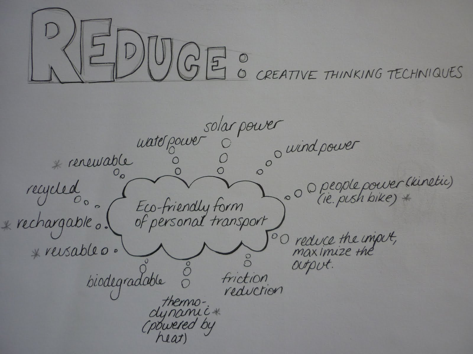
• Had I thought of solar lighting?
No I hadn’t. Eco-friendly and reusable, however there may be a considerable cost to set these up.
• Storage
I have considered the packaging/storage of the lanterns by perhaps designing them to be flat-packed when not in use. This would help preserve them, allow us to reuse them, and not take up too much storage space.
• Shadows from patterns
Something else I hadn’t considered, but if the light is strong enough and the design definitive, I could add another dimension to the display by projecting shadows from the lanterns.

DESIGN CHALLENGE/REFLECT & REFINE
For our practical this week, we have to critique our 3D design concept and make a list of two assumptions about our design, then challenge these, and finally, refine and solve the challenges.

Assumption 1: I assume the lanterns will be hanging up
THE CHALLENGE: Based on most paper lanterns I have seen, the image I have of them is one of them being hung. By hanging them, it keeps the lanterns from being damaged and also allows them to be easily seen.
Why do the lanterns have to be hanging up to be displayed?

I assume that they are all going to be attached to one piece of wiring (and therefore should be hanging) but they could be separated and take on different forms: a lamp-shade style could sit on any surface or they could be like the paper bag filled with sand and sit on the ground.

REFINEMENTS: If I want to separate the lighting components (e.g. fairy lights), I would need to look at cost effective lighting sources. Perhaps I could design the lanterns with flexible display options i.e. they could have tabs to attach to hanging fairy lights and they could also be capable of sitting on its base on various surfaces.

Assumption 2: I assume my lanterns are going to be lit by existing fairy lights
THE CHALLENGE: What else could they be illuminated by?
• Candles/tea lights – these are individual and flexible, however, they pose a fire risk and they aren’t always reliable or continuous (i.e. they can be blown out)
• Solar lights – great for the reusable and environmental aspect, however, they would need to be charged up prior to the display. Could be an expensive set up cost
• Torch – would be portable and likely to run on batteries to allow for flexibility. Depending on the type of torch, it may be too cumbersome and therefore take away (aesthetically) from the lantern.
• Glow sticks – They are portable and typically small, however, they aren’t the strongest light and they can fade away quickly. They generally are not reusable.
• Globes – generally need electricity to operate (with power cords running to and from the globes) but they are probably one of the most reliable lighting sources.
REFINEMENTS: Perhaps battery power would be the most flexible, reliable and efficient (especially if they have the capacity to be recharged).
I do know that battery powered tea-lights and candles exist that could possibly work for these lanterns, not only on surfaces but also hanging if the lantern had a reasonably strong base for the tea light to sit on. This would also mean less safety-risk.


Week 5: 2D


CHALLENGING ASSUMPTIONS

Challenging assumptions can be one of the best ways to generate new ideas. Every time a person is faced with a problem, they bring their own experience and knowledge to it, including biases. There are so many aspects that we just assume – consciously and unconsciously. By having all this existing information or “mental baggage” it can be difficult to come up with new and inventive ideas.


To challenge our assumptions, we first have to identify them.
For our group exercise, we started by discussing the following questions:

Q1. Relatives - A doctor in London had a brother in Manchester, who was a lawyer - but
the lawyer in Manchester did not have a brother in London who was a doctor. Why?

ASSUMPTION: When we first read this question, we assume the doctor is male, most likely due to the male references used (i.e. brother).
ANSWER: The doctor is a female, the sister of the lawyer in Manchester.

Q2. Bottled Money - If you put a small coin piece in an empty bottle and replaced the
cork, how would you get the coin out of the bottle without taking out the cork or breaking
the bottle?

ASSUMPTION: We assume that the only way we can make an opening in the bottle, is to take the cork out.
ANSWER: However, we can also get the coin out by pushing the cork in.

Q3. The Restaurant Meal - Three women each have two daughters, and they all go into a
restaurant for a meal. There are only seven vacant seats in the restaurant, but each has
a seat for herself. How do they manage it?

ASSUMPTION: We assume they are three women who are of the same generation and not related.
ANSWER: They are women of different generations; there is the grandmother (woman 1) who has two daughters (women 2 and 3). The daughters also have to daughters each, making them the granddaughters, so in actual case; there are 7 women, 3 of which have two daughters each.

We then had to read the following story, then list and challenge our assumptions:

MIKE’S AUDITION
Have you ever been in Los Angeles freeway traffic? We were once in bumper‐to‐bumper traffic, trying to get to the airport at 10:30 at night. I didn't know that there were traffic jams until late in the evening.
In any case, if you have had a similar experience, you can relate to the following problem, which will show us how challenging assumptions leads to more creative solutions.
Mike had an audition for a movie role at eight the next morning. But it was in Hollywood, and he lived on the other side of Los Angeles. He was notified of the audition late, and now it was one in the morning.
This was a problem, because it could take as much as four hours to get through the morning traffic, and he needed time to shower and get ready. He would have to get up by a little after three that morning.
He thought about this. Just two hours of sleep, followed by hours on the freeway ‐ this might affect his performance. This would be his first important role if he was hired, so his mind started scrambling for solutions. Taking the bus might be faster than driving his van, but he didn't know the bus schedules, and it was too late to find out. He looked at a map of the city, hoping for a better route, and he might have found one, but it seemed dangerous to guess about routes he wasn't familiar with at this point.
He suddenly recalled a problem solving technique his friend Steve had told him about, and decided to try it. He did the assumption‐challenging exercise, starting with a pen and piece of paper and writing a
list of assumptions.

ASSUMPTIONS:
·      We assume he is driving
·      It takes 4 hours to get through the morning traffic in Hollywood
·      Traffic is going to be bad
·      He is leaving in the morning
·      Assuming he is going to have a nap before he leaves
CHALLENGE:
·      He doesn’t have to drive – he could take any number of alternate transport options.
·      He doesn’t have to drive through the morning traffic. He could plan to arrive at a different time during the day to avoid the four hours in traffic.
·      Traffic may not be bad
·      Again, he doesn’t have to leave in the morning. He could choose to leave at an alternate time.
·      He doesn’t have to have a nap before he leaves, he could have one when he gets there, or not at all.
SOLUTION:
Start driving at 1am, get to Hollywood, sleep, shower, etc before the audition, and he will also beat the morning traffic.


DESIGN CHALLENGE/REFLECT & REFINE
For our practical this week, we have to critique our 2D design concept and make a list of two assumptions about our design, then challenge these, and finally, refine and solve the challenges.

Assumption 1: I assume that the lanterns will be made from paper.
THE CHALLENGE: Paper is quite a common material used for lanterns, due to the fact that it is light weight, cheap, relatively transparent, flexible and so on. Based on these things, I assumed that mine would be paper also – especially because I plan to design and print patterns onto them.
But, why should they be paper?
The criteria for material for a lantern would be quite simple:
·      Lightweight
·      Strong
·      Translucent
What other materials could be considered?
·      Fabric – this is lightweight and strong, but I would probably need to create some sort of frame to support it and keep the lanterns shape. I could also look at some sort of fabric stiffener. I also need to consider how the designs will reproduce on the fabric.
·      Ribbon – I would also need to create some sort of frame first and then I could perhaps incorporate some sort of woven design. Again, there may be some printing issues.
·      String – Again, I would need some sort of lightweight frame. Printing on the actual string itself presents a challenge, however I might be able to incorporate and integrate patterns in amongst the string, rather than on it.
·      Plastic – lightweight like a plastic bag or cellophane, again this may need some sort of frame. Not so eco-friendly if it gets too hot from a light/candle.
·      Lace – I could either use lace itself, or design a lace-pattern. Perhaps I could incorporate the two.
REFINEMENTS: Initially, for some of the lightweight materials, I was thinking I would need to construct some sort of lightweight frame to support the materials not strong enough to hold their weight or keep the desired shape of the lantern. Something like this could be created with bamboo skewers for example, however, it may be possible to create a translucent layer that will hold its shape and then I could attach the patterned layer. If I used a plastic similar to the one used for overhead projector sheets, it would allow for more flexibility in the materials used. For example, I could use tissue paper or fabric on top and it would be strong enough to hold the shape.

Assumption 2: I’m assuming the designs I come up with will be printed on the lanterns
THE CHALLENGE: Because I am creating designs for the lanterns in Illustrator, I assume that I’ll be printing them out, most likely on plain white paper or cardboard.
Why do the designs need to be printed?
The designs could be:
·      Hand drawn
·      Painted
·      Embossed
·      Cut out
·      Sketched
·      Etched
I still want to use the techniques and skills I have learnt in graphic design to make the patterns/designs and I guess to some extent, I would still need to print out my design, but it doesn’t just need to be about patterns and colour.

REFINEMENTS:
I really like the idea of incorporating the effect of cutting out or embossing with my designs/patterns. With these sorts of effects, it may eliminate the need to have lots of colour – the designs can be more subtle.
One of the major parts of pulling this idea off effectively is how I cut out the shapes. The first tool that comes to mind is a scalpel or Stanley knife which allows for flexible cutting, however sometimes the cut edges aren’t always smooth. Some sort of stamp out would be effective.

Week 4: 3D

GROUP EXERCISE – EXPLORING AND CHALLENGING

From this exercise, our group came up with the following ideas for my lantern design concept:
I feel as though I (and my group) addressed these components of ‘Exploring and Challenging’ in 2D for my design as a whole, taking into account both the 2D and 3D components, however, I will recap the 3D ones specifically.

EXPLORATION
Designs for the assembled lanterns themselves
Materials that would be strong enough to: withstand heat from lights, being reused and hold their shape. The lanterns below are made from egg cartons!


CHALLENGES
Designing the template for the 3D structure
Will they be easy to assemble?

PRACTICAL – CONCEPT EXPERIMENTATION, VARIATION & EVALUATION

Two experiments I could conduct on my design concept:
1. I will need to work out how to attach the completed lanterns to existing lights (i.e. fairy lights)
This would cross over with the template design, allowing extra tabs to fit on, etc.
Rather than attach the lanterns to the lights permanently, removable covers would be most beneficial for storage, so multiple use is a consideration when attaching and reattaching them to the lights.
Materials would also need to be considered. I.e. cardboard would be better at maintaining hold on a light (with the use of tabs, etc) than tissue paper would be.

2. Once the lanterns have been assembled into their 3D form, storage and re-use is an important thing to consider, as they are relatively fragile.
Can they remain intact but fold flat?
Can they remain attached to the lights for storage?
What sort of storage would they come with, if any?
Size of the lanterns could affect how they are stored.

Below is a template and a basic prototype I constructed:

Pros:
• Being able to reuse the lanterns through considered and correct storage is cost effective.
• The lanterns have the potential to be completely eco-friendly (by not making the attachment permanent with glue, etc). Also the fairy lights themselves could be used for other decorations.

Cons:
• Budget, for the fairy lights and/or extra lanterns for display, also for storage.
• In addition to the time it will take to establish the template, extra time will need to be taken for the consideration of attaching the lights to the lanterns.

Choosing and Refusing
Most of these ideas need to be tried before choosing or refusing to go with any one method or idea.

Week 4: 2D


GROUP EXERCISE – EXPLORING AND CHALLENGING

From this exercise, our group came up with the following ideas for my lantern design concept:

EXPLORATION
Designs/themes
Materials: translucent, fire resistant, non-smudge print
Templates: whether to glue or fold together

CHALLENGES
Designs, not only for the decorative component, but also for the practical 3D application.
Will these be able to be reproduced fairly easily?
Could it be produced on a mass scale or should it be a boutique item?
Is it fire safe/water proof for outdoor use?


PRACTICAL – CONCEPT EXPERIMENTATION, VARIATION & EVALUATION

Two experiments I could conduct on my design concept:
1.It is important to determine what paper (or other material) the lantern would best print out on. To be able to print the design, the lanterns would need to be made of materials that are translucent, strong, and thin enough to go through a printer.
Ideas to try:
·       Print out on normal paper
·       Print out on translucent (baking-paper like) paper
·       Print out on tissue paper
·       Print out on fabric
I will need to test the ease of which the above-suggested materials can be printed on, also if they smudge or soak up too much ink. I also need to be mindful of the reproduction of the colours as well as the safety of the materials ie fire safe.

2. What would be the most practical way to create the lanterns?
I could try:
·       Folding
·       Tabs
·       Gluing
·       Sticky tape/double sided tape
I need to establish a good working template.
Below is one I sketched out:

Pros:
·       Once a workable template has been developed, it can be continually used.
·       The lanterns can be unique in the way it has been designed, both from 2D and 3D aspects
Cons:
·       Most materials that I print out on will not be fire safe (will need to explore sprays/coatings I can put on the lanterns instead)
·       Normal printing paper would most likely favor printed designs, others such as tissue paper or even fabric may prove to be too delicate, soak up too much ink or not reproduce the colour well.
·       Access to printers
·       Establishing a good template will take lots of time and experimentation
·       Working within a budget (need to consider costs of ink, paper, glue, etc as well as cost of lights to complete the lanterns)

Choosing and Refusing
Most of these ideas can and should be tried out before refusing them outright. I guess I would be a bit more hesitant printing on a material like tissue paper for fear of it getting stuck in the printer!

Week 3: 3D

CREATIVE THINKING TECHNIQUES
Based on the concept of reduce, we had to come up with one design for an eco-friendly form of personal transport.

Using a few of the ideas and associations I made with the notion of ‘eco-friendly personal transport’, I came up with the concept of a thermo-dynamic bike. This would use the heat from your body (once you start generating it by pedalling) to run the bikes motor to either i) go faster; ii) have a break; or iii) conserve/store the generated energy for the return ride.
The bike would absorb the heat from the persons’ body in a couple of ways; from the seat and also from a specially designed jacket that the rider would have to wear (and plug in to the bike). The jacket would be engineered so it would still be of maximum comfort to the rider.

The Thermotion


DESIGN OPTIONS
Based on the ‘Thermotion’ as an eco-friendly form of personal transport, we had to draft 3 design options:

Design Option 1: Thermotion Duo
Function: The idea is to cater for another person on the same form of transport.
This ‘tandem Thermotion’ or the Thermotion Duo works on the same principal of generating electricity gained from the body heat of the riders. The idea of having one rider behind the other keeps the design streamline and efficient.
Materials: Lightweight and strong materials would be needed for the bike itself so as not to use more energy than it needs to. The jacket needs to be lightweight and functional as well as comfortable for the rider.
Style: Minimalistic, practical, eco-friendly.

Design Option 2: Thermotion Quad
Function: It would have the same fundamental function as the Thermotion (generating electricity to power the motor from body heat), but on a larger scale. This model is designed to transport a larger number of people – potentially 4 – all pedaling and wearing jackets to generate heat to power the bike.
Materials: Again, lightweight and strong materials are important – even more so for this design as it has to use more energy for more energy.
Style: I think this design is more about the function than it is about the looks! I would need to have a fairly aerodynamic style to avoid possibly being too cumbersome.


Design Option 3: Thermotion Trailer
Function: This trailer would be for a child and can be attached to either the Thermotion or the Thermotion Duo. The trailer itself would absorb heat from its passenger to give the bike rider the extra bit of power they would need to pull a trailer.
Materials: Lightweight, strong framework, with an optional waterproof cover.
Style: Aerodynamic 

Sunday, August 8, 2010

Week 3: 2D

This week sees us trying our hand at a creative thinking exercise.
After choosing two words, and then thinking of all the possible representations for each, we had to combine them by trying to relate them in some way. From this we then had to come up with two 2D design options.

The two words our group chose were: bottle and flower.


Bottle: Glass; plastic; recycle; colour, red, green, brown, clear; shape, tall, small, fat bottom thin top; heavy; light; lid; used for liquid-like contents: drinks, sauces, jams, makeup, perfume; vase; storage (holding, carrying & pouring liquids); bottleneck; bottle up (restrain); hit the bottle (to drink alcoholic beverages).

Flower: Colour; smell; shape; nature; small; big; symmetrical; sun; life; water, stalk/ leaves; dried; pressed; oils; ingredients; edible; garden; fresh; seeds; bloom (full development); florist; (flour); flora; organ of reproduction; blossom; brightest, best part; floral; spray; cluster; shoot; posy; herb; vine; green thumb; annual; perennial; plant; flowery (elaborate ornament, ornate); decoration.

Here are some of the combination I came up with based on the brainstorming above:

Combos:
·      Bottlebrush – Australian tree/shrub with dense spikes of flowers that resemble a brush

·      Bottle tree - Aust tree with a bottle shaped trunk

·      Using a bottle for a vase of flowers/decoration/to propagate 

·      Using a bottle to store flowers (preserved, oils, in water, dried, etc)

·      A flower shaped bottle

·      A flower on a bottle
      Bottling the smell/colour of a flower

·      A bunch/posy of bottles
·      Bottleneck of flowers
·      A blossoming bottle
·      Recycled bottle flowers
·      A bottle made of flowers

My designs based on two of these combo's are as follows: 
A Bouquet of Bottles

Bottle Flower 
(looking at the bottle from the base)

PRACTICAL
These three design explorations are written up in detail in my visual diary, so this information is merely a summary of my ideas:

Design Option 1: Lanterns
Basically, I began brain storming ideas that would allow easy integration between 2D and 3D designs. My idea is to design a 2D pattern for something that can be assembled into a 3D object - packaging, giftboxes...lanterns! The idea that they can also be potentially reused appeals to me.
Shape: As can be seen in my sketches below, my first thought for lantern shapes is a tetrahedral shape. One of the main challenges would be coming up with effective templates.

Media: At this stage, I am thinking of using paper, a bit stronger than the average type used. This medium would allow me to print on it and assemble it without too much expense. Of course there are other mediums that can be explored, such as fabric, however experiments with printing and assembly would need to take place.
Style: I need to think about the look of these lanterns. Are they going to be colourful and party-like? Are they going to be simple and classic? Are they going to be soft and feminine?


Design Option 2: Badges
This idea is on a slightly larger scale: I would like to use a pig picture or design and then create lots of badges from it. I would then reassemble it to make a more abstract piece of design. I was actually inspired by the pushpin art for this idea.


Above, I started to recreate the look I am wanting to achieve on a smaller scale, with a hole punch. This task proved a bit too tedious and time consuming, so a bit of imagination is required! 
Shape: Because the content will be somewhat abstract (embodying the Gestalt Theory in that people will automatically piece together the absent parts to create a whole picture), I think it would be best to keep the overall shape simple. I.e. by using a square or rectangular pin board.
Media: I would create the 2D design first on a program such as Illustrator, print it out and then cut it out into many small circles to then assemble into badges.
*Sourcing the materials for badge making may prove to be a challenge.
Style: I'm not sure if a pattern would look as effective, overall as a picture or even a photo. Black and white would look effective.

Design Option 3: Labels
Again, thinking along the lines of something 2D that I can integrate into a 3D form, I came up with the idea of packaging - something I've always been interested in. In particular, I have always enjoyed and appreciated a good wine label!
I found a great website called Designer Daily, and on that I found some amazing wine label designs for inspiration! http://www.designer-daily.com/25-brilliant-wine-label-bottle-package-designs-1808 
Shape: The typical wine label is a rectangular shape, but because bottles are generally the same recognisable shape, the sky is the limit for the shape of a label.
 
Media: If I am to design a label and then print it out, ideally it would be easiest to print it straight onto a blank sheet with sticky backing. The thinner the material used, the more likely it will stick to the shape of the bottle.
Style: There are already so many amazing wine labels out there, so to differentiate is a challenge. I think it would be good to pick a theme, i.e. comic book, vintage, girly, cheeky, and brainstorm the possibilities!