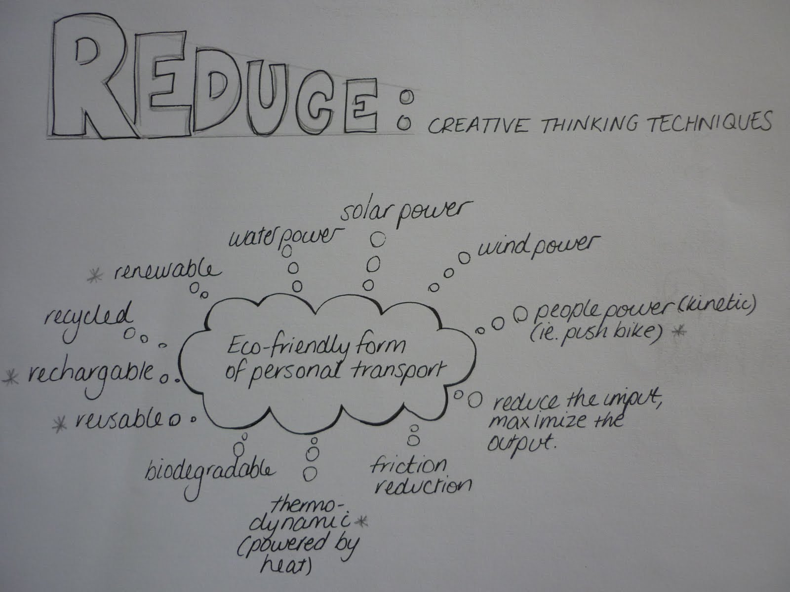
From this exercise, our group came up with the following ideas for my lantern design concept:
I feel as though I (and my group) addressed these components of ‘Exploring and Challenging’ in 2D for my design as a whole, taking into account both the 2D and 3D components, however, I will recap the 3D ones specifically.
EXPLORATION
Designs for the assembled lanterns themselves
Materials that would be strong enough to: withstand heat from lights, being reused and hold their shape. The lanterns below are made from egg cartons!
Two experiments I could conduct on my design concept:
1. I will need to work out how to attach the completed lanterns to existing lights (i.e. fairy lights)
This would cross over with the template design, allowing extra tabs to fit on, etc.
Rather than attach the lanterns to the lights permanently, removable covers would be most beneficial for storage, so multiple use is a consideration when attaching and reattaching them to the lights.
Materials would also need to be considered. I.e. cardboard would be better at maintaining hold on a light (with the use of tabs, etc) than tissue paper would be.
2. Once the lanterns have been assembled into their 3D form, storage and re-use is an important thing to consider, as they are relatively fragile.
Can they remain intact but fold flat?
Can they remain attached to the lights for storage?
What sort of storage would they come with, if any?
Size of the lanterns could affect how they are stored.
Below is a template and a basic prototype I constructed:
Pros:
• Being able to reuse the lanterns through considered and correct storage is cost effective.
• The lanterns have the potential to be completely eco-friendly (by not making the attachment permanent with glue, etc). Also the fairy lights themselves could be used for other decorations.
Cons:
• Budget, for the fairy lights and/or extra lanterns for display, also for storage.
• In addition to the time it will take to establish the template, extra time will need to be taken for the consideration of attaching the lights to the lanterns.
Choosing and Refusing
Most of these ideas need to be tried before choosing or refusing to go with any one method or idea.
Two experiments I could conduct on my design concept:
1.It is important to determine what paper (or other material) the lantern would best print out on. To be able to print the design, the lanterns would need to be made of materials that are translucent, strong, and thin enough to go through a printer.
Ideas to try:
·Print out on normal paper
·Print out on translucent (baking-paper like) paper
·Print out on tissue paper
·Print out on fabric
I will need to test the ease of which the above-suggested materials can be printed on, also if they smudge or soak up too much ink. I also need to be mindful of the reproduction of the colours as well as the safety of the materials ie fire safe.
2. What would be the most practical way to create the lanterns?
I could try:
·Folding
·Tabs
·Gluing
·Sticky tape/double sided tape
I need to establish a good working template.
Below is one I sketched out:
Pros:
·Once a workable template has been developed, it can be continually used.
·The lanterns can be unique in the way it has been designed, both from 2D and 3D aspects
Cons:
·Most materials that I print out on will not be fire safe (will need to explore sprays/coatings I can put on the lanterns instead)
·Normal printing paper would most likely favor printed designs, others such as tissue paper or even fabric may prove to be too delicate, soak up too much ink or not reproduce the colour well.
·Access to printers
·Establishing a good template will take lots of time and experimentation
·Working within a budget (need to consider costs of ink, paper, glue, etc as well as cost of lights to complete the lanterns)
Choosing and Refusing
Most of these ideas can and should be tried out before refusing them outright. I guess I would be a bit more hesitant printing on a material like tissue paper for fear of it getting stuck in the printer!
Based on the concept of reduce, we had to come up with one design for an eco-friendly form of personal transport.
Using a few of the ideas and associations I made with the notion of ‘eco-friendly personal transport’, I came up with the concept of a thermo-dynamic bike. This would use the heat from your body (once you start generating it by pedalling) to run the bikes motor to either i) go faster; ii) have a break; or iii) conserve/store the generated energy for the return ride.
The bike would absorb the heat from the persons’ body in a couple of ways; from the seat and also from a specially designed jacket that the rider would have to wear (and plug in to the bike). The jacket would be engineered so it would still be of maximum comfort to the rider.
The Thermotion
DESIGN OPTIONS
Based on the ‘Thermotion’ as an eco-friendly form of personal transport, we had to draft 3 design options:
Design Option 1: Thermotion Duo
Function: The idea is to cater for another person on the same form of transport.
This ‘tandem Thermotion’ or the Thermotion Duo works on the same principal of generating electricity gained from the body heat of the riders. The idea of having one rider behind the other keeps the design streamline and efficient.
Materials: Lightweight and strong materials would be needed for the bike itself so as not to use more energy than it needs to. The jacket needs to be lightweight and functional as well as comfortable for the rider.
Style: Minimalistic, practical, eco-friendly.
Design Option 2: Thermotion Quad
Function: It would have the same fundamental function as the Thermotion (generating electricity to power the motor from body heat), but on a larger scale. This model is designed to transport a larger number of people – potentially 4 – all pedaling and wearing jackets to generate heat to power the bike.
Materials: Again, lightweight and strong materials are important – even more so for this design as it has to use more energy for more energy.
Style: I think this design is more about the function than it is about the looks! I would need to have a fairly aerodynamic style to avoid possibly being too cumbersome.
Design Option 3: Thermotion Trailer
Function: This trailer would be for a child and can be attached to either the Thermotion or the Thermotion Duo. The trailer itself would absorb heat from its passenger to give the bike rider the extra bit of power they would need to pull a trailer.
Materials: Lightweight, strong framework, with an optional waterproof cover.
This week sees us trying our hand at a creative thinking exercise. After choosing two words, and then thinking of all the possible representations for each, we had to combine them by trying to relate them in some way. From this we then had to come up with two 2D design options.
The two words our group chose were: bottle and flower.
Bottle: Glass; plastic; recycle; colour, red, green, brown, clear; shape, tall, small, fat bottom thin top; heavy; light; lid; used for liquid-like contents: drinks, sauces, jams, makeup, perfume; vase; storage (holding, carrying & pouring liquids); bottleneck; bottle up (restrain); hit the bottle (to drink alcoholic beverages).
Here are some of the combination I came up with based on the brainstorming above:
Combos:
·Bottlebrush – Australian tree/shrub with dense spikes of flowers that resemble a brush
·Bottle tree - Aust tree with a bottle shaped trunk
·Using a bottle for a vase of flowers/decoration/to propagate
·Using a bottle to store flowers (preserved, oils, in water, dried, etc)
·A flower shaped bottle
·A flower on a bottle Bottling the smell/colour of a flower
·A bunch/posy of bottles
·Bottleneck of flowers
·A blossoming bottle
·Recycled bottle flowers
·A bottle made of flowers
My designs based on two of these combo's are as follows:
A Bouquet of Bottles
Bottle Flower
(looking at the bottle from the base)
PRACTICAL These three design explorations are written up in detail in my visual diary, so this information is merely a summary of my ideas:
Design Option 1: Lanterns Basically, I began brain storming ideas that would allow easy integration between 2D and 3D designs. My idea is to design a 2D pattern for something that can be assembled into a 3D object - packaging, giftboxes...lanterns! The idea that they can also be potentially reused appeals to me. Shape: As can be seen in my sketches below, my first thought for lantern shapes is a tetrahedral shape. One of the main challenges would be coming up with effective templates.
Media: At this stage, I am thinking of using paper, a bit stronger than the average type used. This medium would allow me to print on it and assemble it without too much expense. Of course there are other mediums that can be explored, such as fabric, however experiments with printing and assembly would need to take place. Style: I need to think about the look of these lanterns. Are they going to be colourful and party-like? Are they going to be simple and classic? Are they going to be soft and feminine?
Design Option 2: Badges This idea is on a slightly larger scale: I would like to use a pig picture or design and then create lots of badges from it. I would then reassemble it to make a more abstract piece of design. I was actually inspired by the pushpin art for this idea.
Above, I started to recreate the look I am wanting to achieve on a smaller scale, with a hole punch. This task proved a bit too tedious and time consuming, so a bit of imagination is required!
Shape: Because the content will be somewhat abstract (embodying the Gestalt Theory in that people will automatically piece together the absent parts to create a whole picture), I think it would be best to keep the overall shape simple. I.e. by using a square or rectangular pin board.
Media: I would create the 2D design first on a program such as Illustrator, print it out and then cut it out into many small circles to then assemble into badges.
*Sourcing the materials for badge making may prove to be a challenge.
Style: I'm not sure if a pattern would look as effective, overall as a picture or even a photo. Black and white would look effective.
Design Option 3: Labels
Again, thinking along the lines of something 2D that I can integrate into a 3D form, I came up with the idea of packaging - something I've always been interested in. In particular, I have always enjoyed and appreciated a good wine label!
Shape: The typical wine label is a rectangular shape, but because bottles are generally the same recognisable shape, the sky is the limit for the shape of a label.
Media: If I am to design a label and then print it out, ideally it would be easiest to print it straight onto a blank sheet with sticky backing. The thinner the material used, the more likely it will stick to the shape of the bottle.
Style: There are already so many amazing wine labels out there, so to differentiate is a challenge. I think it would be good to pick a theme, i.e. comic book, vintage, girly, cheeky, and brainstorm the possibilities!
This week we had to come up with a design for a CDU Design Student Shoulder Bag:
We could use any tools to do this, however, we had to address three considerations in the designs: shape, media and style.
I started by looking at the current CDU logo and colours:
Although this logo incorporates the colours deep red, black and white, sometimes there is a navy blue used in logos and signage as well. These will be my colour theme.
I then started researching designs of different unisex shoulder bags.
These were a few that I came up with:
Based on the needs of myself as a uni student, I like the idea of the bag that is big enough to hold A3 sized visual diaries and a laptop if needed. I would also like extra pockets, holders, etc for pens, USBs and notebooks. Ideally, I would like this 'uni bag' to be used outside of uni also, so that's an important thing to consider in the design.
After a few rough sketches in my own visual diary, I came up with the below:
Shape: I decided that the most practical shape for this bag is a rectangular A3 size, to fit what CDU Design students typically need to fit into a bag. I decided that positioning it long ways would be something a little bit different. Style: this is where the bag would stand out and not look like a 'uni bag' as such (although it would still include the logo and encompass the university colours). My idea was to be able to use it outside of uni also, so by taking some inspiration from the vintage style bags, I came up with something fairly simple and subtle (in the use of logo, colours, etc). The badges under the pocket also represent CDU in a more subtle way. Media: I thought this bag could be made from a canvas-type material. It is strong and fairly cost-effective to reproduce. There is also the option of making the strap (and maybe the outside pocket) leather for a stylish and durable finish.
This week we had to come up with 2 different template designs for our visual diary page tags: Basically, we could use any tools we wished and we had to address three points of difference in both designs: shape, media and style.
Basically the brief for my visual diary page tags would encompass the following:
The information that needs to be included: >Name >Student Number >Week (which will vary) >Date (which will vary) >Topic (which will vary)
My name and student number can be permanently included on the tags and there also needs to be clear and assigned areas to hand write the other variable details. I need this tag to be simple and practical and I like the idea of keeping it mono and fairly minimalistic, primarily to not take away from the work on the page. In saying this, I would like it to be sleek and stylish with my own little twist.
I explored the concepts both by hand (pencil on paper) and also through digital mediums (Illustrator). As a final medium, I preferred the digital versions as they looked neater and could also be replicated easily. Below are some tag designs I explored:
In all of these designs I tried to make the style a little different - something you wouldn't ordinarily look at and think of a label. In the first one, the shape is a basic rectangle which complies with the minimalistic and practical aspects of a label. As for the style of it, I wanted to try a mono-patterned border, but I feel it looks too busy which contradicts with my theory of not taking away from what's on the page. As you can see with the other two designs, I experimented with different shapes and styles, however, I still didn't feel these were quite what I wanted. I ended up coming up with the below label:
Again, the shape is simple, although it is a more elongated rectangle which I feel would look better on the edge of the visual diary page. I have stuck with the black and white colour theme and created a balanced style which allows for me to hand write in the appropriate details each week. A stylish, yet understated label. I have replicated this and printed it out on paper with a sticky backing: perfect for quick and easy page labeling from now on!
Sources of information for 3D Design was what set us off in search of the weird, wonderful and inspirational. As a class we researched and shared designs, artworks and artists such as Ron Mueck's giant human sculptures, Julian Beever's 3D street art and Theo Jansen's skeletal wind powered creatures. My search for inspiration and information continues...
Eric Daigh - Push Pin Artist Using just black, white, blue, red and yellow push pins, this artist can create amazingly tonal and expressive portraits. Sometimes more than 10,000 pins are used for any one work and looking at them close up reveals a pixel-like effect. A piece can take anywhere between 2 days and numerous months. www.trendhunter.com
Mark Khaisman - Packing Tape Portraits
These works of art are made out of translucent brown packing tape layered up on top of sheets of Plexiglas. I love the way Khaisman has just taken a simple household object and created works that almost look like sepia photos! Very effective. www.trendhunter.com
SA Shimmel Gold - Portraits From Junk Mail Aside from the amazing mosaic effect this technique portrays, I really like the idea of recycling something like junk mail, which most people receive in their mailboxes everyday. www.shimmelart.com/collection.htm
With all the artists and designs explored so far, I love the fact that anyone, including myself, has all these simple/common materials at our fingertips. It is inspiring to know that we are just as capable to create such interesting and clever works. Now the question is: what commonplace, household objects could I use to create a masterpiece??
As for integrating designs into a 3D environment, I found the following works to be of interest:
Katie Sokoler - Guerrilla Street Shadows This artist cuts out life size figures of herself and her partner (of what looks like sheets of black foam or cardboard) and then plasters them onto walls and city surfaces. She then waits for the right moment for a passer-by to be lined up with the shadow for the perfect photograph. A clever and subtle way to incorporate a flat 2D image into the 3D realm.
3D Street Art for Pedestrian Safety Auckland City Council wanted to creatively raise awareness about the importance of pedestrian safety. In Auckland city 70% of road crashes involve pedestrians crossing the main roads. These 3D illustrations warn pedestrians of the dangers of crossing the road carelessly. Like Julian Beever's street art, I think these are very clever and effective visually. I like the fact that these works have a purpose and they are in the perfect places to reach their intended audience.
And whilst on the idea of 3D chalk drawings, I think the music clip Strawberry Swing by Coldplay is one of the cleverest I have seen. It would be amazing to be a part of a team that together can execute such a feat through amazing drawings, artful perspective and photography. Below is the link to the clip for your perusal: http://www.youtube.com/watch?v=BYtk1Z0UUuE