Monday, October 18, 2010

Week 12: 2D & 3D


This week sees me making good progress on my lanterns.
Basically, now that I have established the style, shapes, sizes, templates and patterns of the lanterns, I have been doing lots of tracing, cutting and assembling (as can be seen below)!

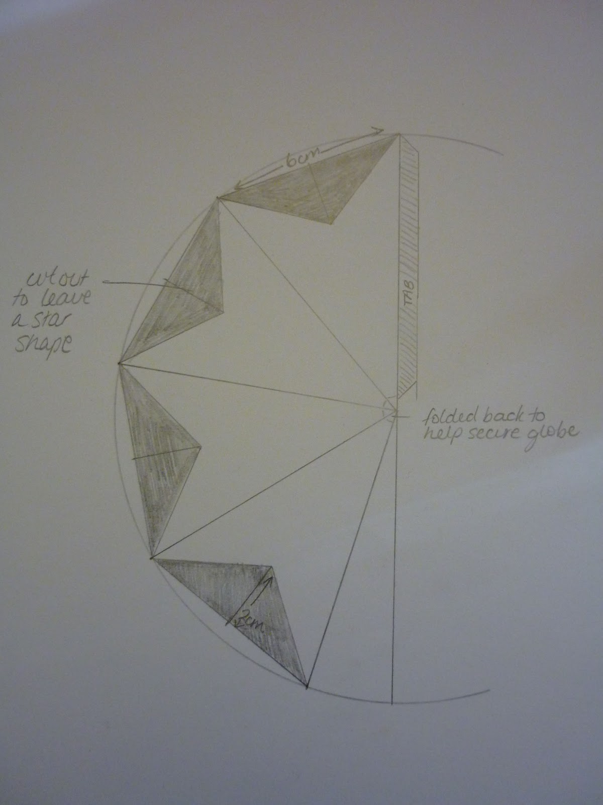
To begin the assembly of my lanterns, I take the cut-out shape (which already has my laser printed pattern on it) and begin by folding the tab in. I want the pattern to be on the inside of the tertrahedral, so it will be visible when the whole lantern is assembled.

Once the tab is tucked under, it is folded in half, so all the corners meet.


 Then open it up again and fold the two outside bits in to meet the middle fold. This gives you the four even sides of the tetrahedral.

Then four small slits are made in the top.

These are then folded in. They act as small tabs which help to hold the globes in place once pushed through the top of each little lantern.

Double-sided tape then goes onto the tab.

Then the four sides are sealed.


And one of the components of the whole lantern is completed! 

Now to continue on making another 20 (as the design seems to comfortably fit 21 tetrahedrons as opposed to 18 as initially thought)!
***

My fiancé and I have been able to perfect the lights, so the wiring is not even seen when the lantern is complete, it is all contained within the paper structure.
I have also created a slight variation to my current tetrahedral template to make a smaller, more ‘star-like’ lantern to compliment my existing larger ones. 

I am now thinking of hanging 4 lanterns in a cluster consisting of two larger ones and two smaller star-like ones. Only one large one and one small one will be lit (due to cost and time restraints).


Monday, October 11, 2010

Week 11: 2D & 3D


After presenting our 2D/3D exhibition pieces, we had to give feedback on the effectiveness of everyone’s design process and concept communication. My thoughts are as follows:

Zac
1. Effectiveness of design process – starting a new concept evaluation (4 panels representing the lifecycle) -  likely to run into time constraints as we only have three weeks left to complete our works if he wants to continue with this new concept.
2. Effectiveness of concept communication – I really liked the concept of Zac’s new idea, and the fact that he continues to evaluate his designs. Good ideas can come up at any stage in the design process.
3. Progress in the last week – no progress on original designs presented to us last week, but Zac had a new concept to present. May be unreasonable to complete due to current time restraints.

Carol
1. Effectiveness of design process – well planned and thought out, although the design process of the 2D component is not as clear.
2. Effectiveness of concept communication – I am a little unclear as to what this piece is representing (ie. skills learnt from the course).
3. Progress in the last week – has completed the 3D aspect.

Sarah
1. Effectiveness of design process – it was good going through her logo design process, it shows that she has put thought into the way she goes about designing her work.  
2. Effectiveness of concept communication – I think Sarah is well on her way to presenting an effective piece of communication in itself. Her explanations and intentions are clear.
3. Progress in the last week – clothing brochure was presented in colour and her logo has been refined.

Stevie
1. Effectiveness of design process – I think Stevie’s design process has been clear to date, it would be good to see some working prototypes.
2. Effectiveness of concept communication – I think the prototypes would help the effectiveness of the design communication at this stage.
3. Progress in the last week – she has created a grid to go over the ‘Smile’ photo and is almost ready to print.

Jarrod
1. Effectiveness of design process – has progressed well presenting some drawn and traced designs. Has been very good with researching prospects, materials, etc.
2. Effectiveness of concept communication – the concept is clear and it has great potential.
3. Progress in the last week – Has drawn/traced some designs and explained how they will look on the front of his wood-cover portfolio.

With regards to my own exhibition pieces – this week I have really been concentrating on the lighting for my lanterns. I was initially going to use a pre-existing lighting set up (ie fairy lights), but with consideration of the new spherical design, this may prove to be more difficult. After some thought and discussion (with people in the know of electronics), I feel that individual LED lights would be the best way to light the lantern. Each tetrahedron would have their own LED, and the whole group would be powered by battery (9V) for flexibility and to help keep the design minimal. The LEDs also produce a ‘cool light’, perfect when they are lighting paper lanterns to minimise fire risk, etc.

After having finished the prototype lantern, I now know that it takes 18 tetrahedrons to complete the shape of the lantern I am after. 


With the help of electronics ‘expert’ (my fiancĂ©), we began to build a working prototype of how the lantern will be lit, how it will hang, etc. By doing this we also established the best process and order for putting it all together (as they are somewhat delicate).


This piece is really starting to come together!


Friday, October 8, 2010

Week 10: 2D & 3D


Concept Evaluation (Group Exercise)
Today we had to reflect on the effectiveness of our design process and concept communication. To do this, as a group, we had to verbally evaluate each member’s 2D/3D exhibition work. As a group, we came up with the following thoughts for each of us:

Stevie
Design process:
Stevie has demonstrated a moderately clear process for achieving her exhibition piece. The end result can be visualised by most, however, the design needs some testing, ie. a prototype. It may be a good idea to try different variations.
Concept communication:
The concept is to create a happy vibe, so the photos of the ‘smiling frog’ are easily understood and recognised as the underlying ideas.
Amelia
Design process:
Very well thought out, thorough. Has documented ideas and created prototypes to experiment with the overall design.
Concept communication:
“Bringing light to the world” in an aesthetically pleasing manner. The concept also highlights the fact that they can be reused.
Sarah
Design process:
Sarah’s design process is well thought out and she has many ideas that could tie in (time permitting) executed and a prototype that works. In particular, the swing tags are a great idea and could do with more experimentation, again, time permitting.
Concept communication:
The concept of fashion design and promotion is clear, especially having seen the prototype/s.
Jarrod
Design process:
Jarrod’s wooden portfolio cover is a practical, useful and unique idea. His design process has been thorough: he has researched possible materials, created prototypes and has experimented with designs. His process is clear and well thought out.
Concept communication:
The concept is clear: he wants to make unique portfolios for the unique designer to help make an impression. Perhaps more work can be done on prototype.
Zac
Design process:
Some good experimentation has taken place with photos/programs. Zac continues to further his skills by completing online tutorials, etc.
Concept communication:
The concept wasn’t overly clear, but with some more development, it should become more clear.
Carol
Design process:
Carol’s design process has been thought out and documented. From what we saw, she has got all the materials and could show us a step-by-step process from start to finish.
Concept communication:
The concept of her exhibition piece is not very clear, and when explained, it is very broad.
Jess
Design process:
Jess is still running through lots of different ideas for her exhibition piece. Her main idea of a large picture incorporating her drawings of anime and graphic design sounds good, but it needs to be developed.
Concept communication:
Her concept to bring anime into graphic design is clear, however, this idea still needs some refinement.


We then continued on with the development with our 2D and 3D exhibition pieces.
I was able to develop a couple of black and white patterns I have been working on for my lanterns:


Thursday, October 7, 2010

Week 9: 3D

Concept Realisation (Group)

We had to present and discuss our 3D exhibition pieces with the class. This was a good exercise as we all got a clear idea on the stages that everyone is at for their own works. It was also a good opportunity to provide feedback and suggestions based on their latest ideas.

With regards to my 3D piece - lanterns - I have developed them into something that I believe is more visually appealing. Initially I was thinking of making individual tetrahedral lanterns (and lighting them up individually on a string of fairy lights), however, now, I have come up with the idea of attaching all the tetrahedrons to each other, to make one spherical lantern.


Above is my prototype (which only has one side completed so it sits flat at the moment), but it gives a clearer idea of my new lantern design. This also means I need to rethink my technique for lighting them as the lights will be all centred now and I don’t necessarily have as much room for cords, etc. At this stage I think LED diodes connected to a battery might be more flexible for this design.

I would like to hang them in a cluster of perhaps 2 or 3, all of different sizes and at different lengths. At this stage, there has been no need for me to collaborate with other schools.

Design Realisation (Practical)

My proposed exhibition works are:

Lanterns

• Dimensions:
I am looking at creating 2-3 spherical-shaped lanterns with the largest being approximately 20cm in diameter. The other 1 or 2 lanterns will be of the same shape, and smaller, however I am yet to determine their approximate dimensions.

• Display requirements (hanging / floor space / special FX / audio / video):
I would like to hang these 2-3 lanterns from the ceiling. They will be all at different lengths. At this stage I am looking at using an independent power source (ie battery), so the location need not be restricted to a power point.

• A short description of the concept:
I wanted to create something that is aesthetically pleasing and something that can also be used again.
Lanterns can be both of these things and they also allow me to incorporate the 2D aspects of my own patterns and designs with the 3D structure/construction of the lantern. All over the world, lanterns have an association with celebration and relaxation, so I have tried to convey a sense of warmth, welcome and simple elegance. After all, life is all about enjoying the simple pleasures!

• The name of the piece:
Illuminated Design

• Materials used:
Translucent paper with laser printed patterns
Double sided sticky tape
Battery, LED diodes

Week 9: 2D

Concept Realisation

As a group we sat down and discussed what would make an effective poster for the uphere exhibition.
We had to sketch in our visual diaries and produce a range of possible poster designs abiding by the following parameters:
1. Clear rendition of 3 poster layouts using the logo & text supplied
2. The design must have space for sponsor logos
3. CDU logo must be on the right

Here are the 3 sketches of poster designs I came up with:
This is a basic poster design; it incorporates all that has been specified and the name uphere up the top creates a bit of interest by having it hanging like the logo.
The second poster design idea came from the strings from the uphere logo. I thought that it would add a bit of a creative/quirky element to the design if the letters were being held up like a marionette puppet.
This last design is based on our group collaboration of ideas. We thought it would look good if people (students) were each holding the letters of uphere in front of their faces or with their heads in paper bags. This would be based on a photo with a clean white background. I feel this approach adds a creative humour.

Design Realisation (Practical) 


After designing the general concepts (above), we then had to complete a poster layout for each in Illustrator. These are just roughs:

This layout is based on the first basic poster design but is also incorporating the idea of the students holding the letters. We experimented with a couple of photo shoots, projecting the logo onto a screen, trying different lighting and other techniques, however, we found that the image (and the exhibition name) was most clear when we actually printed the letters out and held them up. 

This is based on the marionette puppet idea. Hands could be added to make it clearer as to what it is meant to be, however, I left it as that. I don't think that it is quite as interesting to look at as the posters with the with students holding up the letters.

 As mentioned, these layouts have been designed as roughs just to help present my concept ideas. I have very quickly cut out the images and placed them on a white background. This gives the impression that the students holding the letters could be floating or hanging there. I like the cleaner look of the white for the background.

Monday, September 13, 2010

Week 8: 2D & 3D

Logo Design

Today we spent our 2D and 3D class coming up with some more logo ideas for the exhibition.
The specifications of the logo have been refined: the tag line is "revealing creativity" and we can only work with the colour palettes given to us by the University.

As a class we went through some basic design layouts and fonts. Once we had narrowed down what most of us liked, we then began to work on our own designs.

I still like the idea of 'uphere' being at the upper end of the logo - it is representative and I believe it creates a bit more interest than it would if the brand were centred.
I have joined the letters to look at though they have been hung up, like drying artworks/photos, however it also looks a bit like washing on a clothes line!
This logo follows on with the idea of 'hanging' the letters. I have also inverted the colours to give it a slightly different look.
This logo has followed on from one of my earlier logo designs (see the horizon designs previous 2D post) to break up the colours a bit more.
I wanted to try and incorporate the third colour in the Bold Palette - the green, to see how it integrated with the other colours. I also wanted to make the "revealing creativity" a bit more creative, so I decided to extend the y's tail with the paintbrush free-hand. I like the look of this one, but when I corrected the green as per the palettes specifications, the overall logo didn't look as good - the green was actually too dark and did not look as appealing on the orange background as is does the purple. 
Again, this logo design was made to continue my experiments with the design (as it is not the correct green). This logo was shown to the class and after a few more tweaks, I made a few versions with the correct colours:

Friday, September 10, 2010

Week 7: 3D


Design Communication
I have chosen my 3D design that would appeal to a fashion label and the following are the key concepts and feelings that I am trying to communicate:

Key Concepts
◊ Light
◊ Simple/complimentary
◊ Environmentally friendly
◊ Point of Difference

Key Feelings
◊ Glamour/elegance
◊ Warm/welcome
◊ Indulgence (all about the individual)
◊ Value


My design has been refined to communicate the above key concepts and feelings in the following ways:
Light & Warm Welcome – the lantern will emit a soft warm glow.
Simple & Glamorous – The shape and patterns on the lantern convey a simple, complimentary elegance.
Environmentally Friendly – White/cream translucent paper will be recycled and environmentally friendly.
Point of difference/Value – These lanterns could be incorporated with labels, signage, etc and they would become a good point of difference and convey value (also linked to the glamorous/elegant element).

Concept Investigation (Group Exercise)

1.  Clear rendition of 3 key concepts
Jarrod – 8, 8, 8 = 8
Carol – 7, 10, 7 = 8
Amelia – 9, 9, 9 = 9

2.  Clear rendition of 3 key feelings
Jarrod – 9, 9, 8 = 8.6
Carol – 8, 8, 8 = 8
Amelia – 9, 9, 8 = 8.6


3. Immediate visual appeal
Jarrod – 9, 8, 7 = 8
Carol – 7, 7, 7 = 7
Amelia – 9,9 8 = 8.6


Wednesday, September 8, 2010

Week 7: 2D


Design Communication

Here are some of my logo drafts for the student exhibition with the brand name UPHERE:
I have decided to represent the name in the following format: uphere

The 3 key concepts I am trying to communicate are:
·       Work by students/exhibition by students
·       Territory/Darwin
·       SIMPLE

The 3 key feelings I am trying to communicate are:
·       Relatable
·       Relaxed
·       Thoughtful


All of my logos are simple and minimalistic - I believe it is these qualities that make an effective logo. For each of my logos I have kept with the simple square shape and I have used a san serif font to keep the overall look clear and uncomplicated. I prefer all lower case letters for the name ‘uphere’ and I have tried to tie in the purple and the orange colours’ of last years logo - of course, all of these aspects can be altered to suit the masses.

1.    In This Spot
I got the idea for this logo by looking up different meanings for ‘up’ and ‘here’. ‘Here’ can also mean “in this spot” (or location)-hence why I have chosen the theme of the ‘spots’. My aim is to guide the viewers’ eye up to the name of the exhibition ‘uphere’.

2.    Simple Orange
This is a very simple logo, yet I feel the contrast and simplicity is eye-catching and uncluttered. Again, the logo ‘uphere’ is in the top right hand corner stating its position.

3.    Purple Squiggle
This is more of a casual/colloquial kind of logo, with the free-hand element of the squiggle leading the viewers’ eye up to the name: ‘uphere’. It reminds me of flying a kite. It is less structured but it sticks with my theme of simplicity.

4.    Above The Horizon
This idea was inspired by one of the many alternate meanings of ‘up’. It can also mean “above the horizon”, so I came up with an iconic representation in my logo using the orange and purple colours – quite suiting for a sunset really!

5.    Up On Here
Experimenting with the horizon theme, I came up with a slightly different layout using black and orange with the word ‘up’ on top of the horizon and ‘here’ below. I don’t know how this one will work as I believe the name is all one word.

*As I was late to class, I did not get the designs done in time to be rated by the group.

Week 6: 3D

DESIGN PERSPECTIVES
Based on my favourite 3D design, paper lanterns, here are two variations:

• Design 01: Design in a style that appeals to a community sports group


The Sports Lantern
My first thought when combining paper lanterns with a community sports group was decoration (for an awards night or grand final celebrations) in the clubrooms. Depending on the theme of the sports group (eg. Football, netball, golf, soccer), it could be a novelty to have lanterns representing the sport for celebrations.
Then I thought of a more portable idea in that the lanterns could be used (with a portable battery light) for a night match. Lanterns could be made into the appropriate shape and team colours as a show of support.

*I was not in class for my design to receive a rating from class members, however, I have assigned a quantitative rating for my design based on the criteria below:
1. Accuracy in addressing the brief - 9
2. Immediate visual appeal - 6
3. Cross generational appeal - 7
4. Artistic depth - 6


• Design 02: Design in a style that appeals to a fashion label


Illuminating The Way
I thought something funky, ornate and elegant could represent a fashion label. Not only could the fashion label have these lanterns within the store, they could run the same theme throughout on signage, clothing labels, etc.
The lanterns don’t necessarily need to be hanging, they could also be placed on tables near dressing rooms – the design on these lanterns could also be used for wallpaper, wrapping paper, bags, labels, etc.

*I was not in class for my design to receive a rating from class members, however, I have assigned a quantitative rating for my design based on the criteria below:
1. Accuracy in addressing the brief - 9
2. Immediate visual appeal - 8
3. Cross generational appeal - 8
4. Artistic depth - 6

Week 6: 2D


DESIGN PERSPECTIVES
Here are my two logo designs based on the brand name: BLOOM

• Design 01: Design in a style that appeals to a design Industry client


I ended up choosing one of the designs that I had sketched with the non-profit arts organization in mind! After experimentation with this sprouting idea in Illustrator, I decided it’s simplicity, clean lines, interesting use of colour and general overall look would be more suited to a design industry client. Although minimal, I feel it has a bit of an edge to it.

* I was not in class for my design to receive a rating from class members, however, I have assigned a quantitative rating for my design based on the criteria below:
1. Accuracy in addressing the brief: 10
2. Immediate visual appeal: 9
3. Cross generational appeal: 8
4. Suitability for print: 9
5. Suitability for web: 9
6. Monochromatic suitability: 7
7. Simplicity: 10


• Design 02: Design in a style that appeals to a non-profit arts organization

I played around with so many designs in Illustrator based on a tree with fruit (as bloom can also mean “to bear fruit”), however none of the designs I came up with did the idea justice – until I got rid of the tree. Although people don’t immediately think of fruit when thinking about the concept of ‘bloom’ (it generally brings to mind flowery connotations), I wanted to go with this idea to make people think beyond the obvious. Being a little more abstract, yet still visually appealing and organic, I thought this design would be appropriate for the non-profit arts organization.

* I was not in class for my design to receive a rating from class members, however, I have assigned a quantitative rating for my design based on the criteria below:
1. Accuracy in addressing the brief: 10
2. Immediate visual appeal: 8
3. Cross generational appeal: 7
4. Suitability for print: 9
5. Suitability for web: 9
6. Monochromatic suitability: 7
7. Simplicity: 10